25/04/2012

Tutorials

So I made some tutorials in Photoshop, here's how they turned out.

Yeah... You'll probably find this about the same level of creepy as I do. Interesting style, but scary. It was quite tough to make it look realistic while keeping her natural colour of skin.
Source Images: [ 1 ] [ 2 ] [ 3 ]
Source Tutorial: [ 1 ]

This one was super easy. I turned an orange into an apple. Not a lot more to say here/
Source Images: [ 1 ] [ 2 ] [ 3 ]
Source Tutorial: [ 1 ]

I really like to look of this one, but once again it was super easy. Except for making the water colour texture by copying and pasting the water colours in different sizes and shapes to make it look irregular, that was a little tough.
Source Images [ 1 ] [ 2 ] [ 3 ] [ 4 ]
Source Tutorial: [ 1 ]\


End of Line.

08/03/2012

5 Page Brochure


Program Used: Adobe Photoshop CS4
In this project, I had to create a 5 page magazine layout for a company. I was inspired by this, this and this brochure layouts. I decide to incorporate strawberries and make a pun out of the Beatles song "Strawberry fields forever" by making it literally a strawberry field location. This project was not too difficult, but it was challenging to make it look a bit professional. I'm not used to making pages flow together to that was difficult for me. I love the logo I made, it has the Beatles at the bottom for a beautifully pen-tooled Strawberry.  The rest of the magazine I am in kind of happy with. I like the lines and the way they flow between the pages. I think the second pages are way too busy, there are too many images on the page and it doesn't look clean. I think the third pages as the best because I in-cooperated the coloured text to make everything link up. I am reasonably happy with the way this turned out, but I can see a lot of things wrong with it.
End of Line

06/02/2012

Picture It Twice


Program: Adobe Photoshop CS4

Here are the three business cards I made in Photoshop. The first one is of Jeff Bridges, I just had to edit colours, find a suitable font and fit it in nicely. It was pretty simple to make. The second one on the Xbox controller literately took me about 10 minutes at the most. And 7 minutes of that was cutting out the Xbox controller. I just copied to text style from a previous project. I think it looks the best. The third is hideous and I spent way too much time on and I gave up. I tried so many different things to make it work and nothing went as planned. Some many thing I would spend an hour doing, then I would decide I didn't like it and delete it. I'm extremely disappointed with how it turned out and I am embarrassed to hand the Garret Hedlund one in.
I learned that sometimes a simple design is better and looks more professional. Just because a lot of effort is put into something, doesn't mean it will be guarenteed to look amazing. you need to put yourself in the mind of how others would see something without knowing the effort you put behind it.
Image Source: [ 1 ] [ 2 ] [ 3 ] [ 4 ] 
Tutorial Sources: [ 1 ] <=Failed Miserably [ 2 ]
End of Line.

18/01/2012

Many From One - Two Page Magazine Layout

Program: Adobe Photoshop CS4

I made a two page layout of a magazine article. I WAS going to do a Tron magazine, but I randomly thought of a concert, and found this beautiful image and couldn't say no. I wanted to make the pages different than the example, so I searched online and was inspired by this and this. I took the font and cut it out so that it continued with the image when it says "But where do these lights come from". I then took the image on the left and cut it up. This ended up looking like more of a website than a magazine, but that's okay. It would have been easy to make it look more like a magazine with more font, but by the time it was offered, I had already fit everything in perfectly and was not going to redo it. I'm not really happy with the result, it looks like a webpage layout. The only thing I like is the way the image continues in the picture, and how well of the words fits. And I like the picture, but that's about it, I think it's from sims or some other video game. It's not real humans.
Image Source: [ 1 ]
End of Line.

Skydiving Coupon

Program Used: Abode Photoshop CS4

This is my coupon for skydiving, I took an image of a girl skydiving from google (I didn't like the stock images) and cut her out. Then I found a picture of earth that I liked and put it underneath. Then I put font a matched them colour to her outfit. The font was hard to read because the background is so colourful, so I added a black shadow so it was legible, I think it made it look better too, so that was bonus. I found anothe image of someone skydiving, cut her out, and coloured it straight black, then edited it until it looked recognizable so that I could make an awesome logo. I put the name in and added more shadows. I am relatively happy with the result. I think it's a but too busy and I don't like how big the font has to be, but that is how advertizing is done to I understand why it needs to look the way it does.
 On a side note: I will be going skydiving with my dad after I graduate. This has made me more excited about that.
Source Images: [ 1 ] [ 2 ] [ 3 ] [ 4 ]
End of (Sky)Line.

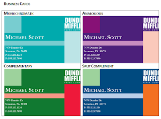
Business Cards


Program Used: Adobe Photoshop CS4

These are business cards that I changed the colours of. Not a lot to say here. They have the different colour schemes. I like the Monochromatic the best, because turquoise is my favourite colour.

End of Line.

Table ot Contents


Program Used: Adobe Photoshop CS4

This is my Call of Duty table of contents for a magazine. This was pretty easy to make, I just played around with the settings and cut out some of the objects. Everything just seemed to fit into place on it's own, I would try to fint somewhere to place the image and every time I would find the perfect area. The hardest part of this projects was making the knifed 52, and even that was easy. The colours go together reasonably well. I'm happy with te way it turned out, I don't really think it looks perfessional, just it looks similar to the example, so that's good.
Tutorial Sources: [ 1 ]
Image Sources [ 1 ]
End of Line.