01/12/2011
Custom Movie Poster: TRON
Program Used: Adobe Photoshop CS4
This is my custom movie poster that I made. I was inspired by the Tron Legacy movie poster and wanted to make my own. I started with the clouds and just did random paintbrushes until I was happy. The grid was easy I just had to make a grid and scale it to make it look 3 dimensional. The text was a simple tutorial and took me no time at all, but I played with all the setting that were given and changed the colours until I was happy with the appearance. I added the faint grid in the back to make it look more computer-ish or something. I don't really know why I added it, all I know is it looks better with it. Then I made the Eiffel Tower. That was annoying. Cutting around it was a chore and and I'm still not 100% happy with the result, but it will have to do. The colour and exact cutting isn't how I would have liked it to be. The glow effect on the tower made it look a bit better, thankfully. And I added a reflection to it doesn't look so two dimensional. And then there was me. Oh my goodness, I am a genius. Who needs to cut out hair when I have a hood on? That made it so much easier for me. I am a perfectionist so I copied one leg and put it on both sides, same with the arms. Next the controller. the controller was already glowing, but I had to change the colours because it was the totally wrong blue, as well I had to copy the buttons because they needed to stay red, blue, green and yellow like the original controller. I then added my thumbs on top of the controller so that it actually looked like I was holding the controller. Next the glowing parts of my shirt. I used the pen tool, made the shapes on one side, Then copied them one to other side and moved the shoulder one around because my shoulders are lop sided in the picture, then I JUST USED THE TEXT EFFECT. I JUST PRESSED A BUTTON AND BAM. GLOWING. IT WAS THAT EASY. I edited the effect to make it smaller, but that's about it. Cedits are what it actually says in the movie poster. As I said before, I am a perfectionist. The glow behind the tower was a final touch, it's just a paint brush line with gratient overlay. And now I'm done. Overall I think I could have done better, but I'm reasonably happy with the result. I think it's decent.
What I learned from this is that text editing it a breeze with a tutorial. The guy has like a half British, half Australian accent. Why do all tutorial people has accents? I leaned that gradient maps are my friend. I learned it's very difficult to put a human in a photoshop document and make them look like they belong, they stand out way too much and so many colour and effect changes have to be done to make them stay within the document. I think I failed miserably at this.
Inspirations: [ 1 ][ 2 ]
Source Tutorials: [ 1 ]
Source Images: [ 1 ][ 2 ]
Fonts: [ 1 ][ 2 ][ 3 ]
Personal Pictures Used:
21/11/2011
Movie Poster Tutorial
Program Used: Adobe Photoshop CS4
This is the movie poster I made with a video tutorial and images provided by the video. It was relatively simple, the only difficult part was listening to the man's voice. I can't stand it. I don't know why, it just drives my crazy. He just changed pitch at weird times. He also goes way too into detail with really obvious things and stops designing to explain something I already know, which is really boring. Then at other times, he assume the listener already knows things that I don't know and I have to go back and watch it three times to figure out what he's doing. Which might I add is even more annoying because I have to listen to his voice saying the EXACT same thing 3 times. On the bright side, I have fallen in love with the clipping mask. It is amazing how you can erase an image then get it back like that. Overall the tutorial was fun and I learned stuff, but the voice drove me nuts.
Source Tutorials: [ 1 ]
End of Line.
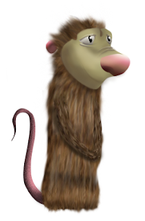
Photoshop Tutorial: Possum
Program Used: Adobe Photoshop CS4
This assignment was a a tutorial I had to follow in order to make a Possum in Photoshop. It was a little difficult at first because I haven't used Photoshop in two years, but once I got the hang of it, it was pretty easy. I was surprised how easy the shading and lines were to put in. And I am completely mesmerized by the creation of fur, all you do is make noise and smudge it, it's so easy yet it looks so good! The pen tool is tricky, but the fact that we used CorelDRAW before makes it a million times easier because we used the nodes the same way. I also learned I own a useless graphic tablet and I need to buy I new one. Good bye pay check, hello new tablet.
Source Tutorials: [ 1 ]
End of Line.
Logo Design: Diablo Networks
Program: CorelDRAW 10
I was able to design several copies of logos for a company. The company I chose was "Diablo Networks". It's description was "a fast gaming network". I made a couple of complex designs then made a few more simple ones, I also took many of the complex logos and just edited them in different ways. Overall this wasn't as fun as the Vector Yourself project because I think I was making the logos too complex and had to rush to finish in the end. I am proud of a few on them, I love the ones where the words shape the game controller; that was the most difficult to make, especially since the D had to not look like an O, even though it is that shape of it on the outside. The flash drive is my love and joy, I am impressed by how simple it was the actually make that one while how impressive it looks. I would not want to do this again, I think making 3 of each and making each of them more complex would be a lot more fun than rushing the make 6 of each style.
End of Line.
20/10/2011
Vector Youself
Program: CorelDRAW 10
This was an assignment where I took a picture of myself and had to make it into a Vector image. This was the most amazing project I've done so far in any computer class. At first it took a bit to remember what I had learned about CorelDraw in Grade 9 in my Computer Graphics 11 class, but once I remembered the keys and shortcuts, I got into the groove. I had a blast vectoring myself and I think I may have gotten a little carried away... I could see myself doing this for the rest of my life but you never know, I may enjoy something even more than this. I loved making the face and features, but the hair was an absolute nightmare.
End of Line.
20/09/2011
Logo Tracing: Shell & Canucks
Program Used: CorelDRAW 10
This is my tracing of the Shell and Canucks logo. Because I used Corel Draw in Grade 9, this was incredibly easy, but still fun to do. It was good to get back into the groove of Corel Draw with the amout of time I haven`t used the program and it was a nice reminder of how to use all the settings, but it still was super easy.I love this program and I am hoping the next project will be more of a challenge.
Source Images:[ 1 ][ 2 ]
End of Line.
Blog Portfolio
Program Used: Blogger.com
This is my Blog Portfolio. I had a lot of fun making this blog and adding the background and fonts. I wanted to really customize it. I wanted a theme and I thought what better theme than the 1982 movie that was all about computers, computer graphics and video games, Tron! I tried to incorporate the background colours with the font colours and make everything kind of go together. I had a lot of fun making this blog and I am proud of the result.
Image Sources: [ 1 ][ 2 ]
End of line.
Subscribe to:
Posts (Atom)